Overview
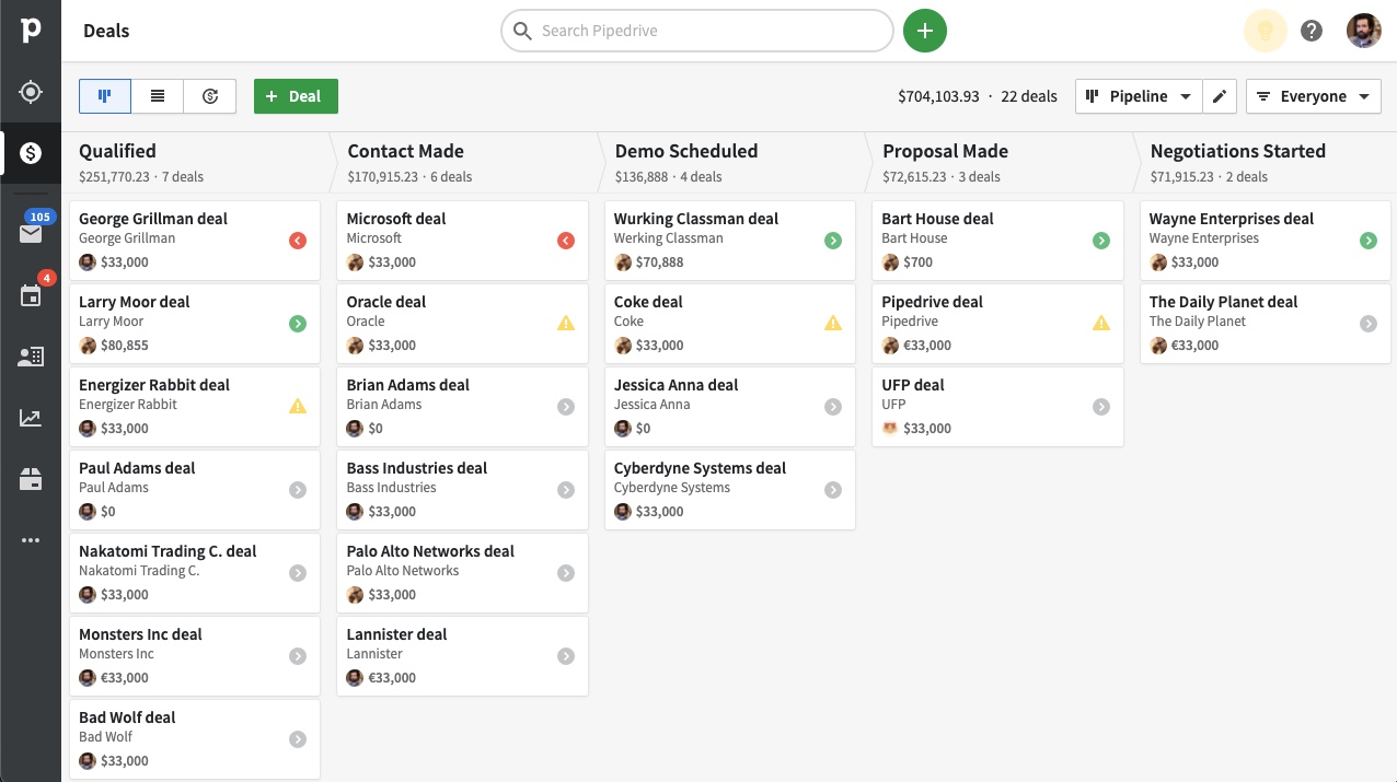
Pipedrive is a cloud-based, easy-to-use, CRM tool that is made for salespeople. Used by over 100.000 companies in more than 170 countries.
I worked at Pipedrive as a Product Designer for their design systems. Their token-based, theming-ready system is publicly available in Figma Community, you can check it out for yourself here.
One of my main responsibilities was advancing the components and design patterns used in the web app. This is one of the projects that I worked on: Snackbar component.
Role: Product Designer
Project: Snackbar component (Rethinking use cases)
Year: 2022
What I Did
A question came up if we could use the snackbar component for different state declarations, like errors for example. We decided to explore the use cases for this component and dig deeper.
How might we give more detailed or meaningful feedback to users about the app process without causing a lot of distraction?
Research
The research process had two phases: Internal and External.
Internal Research: This phase included conversations with product designers in the company on how they show error messages in the product, exploration of how the snackbar component is being used in different products, and a quick look at discussions that took place in the past about user feedback and notifications.
Our internal research showed us that some designers already use this component to show error messages, and some legacy design issues require a different way to show error status in addition to inline messages. We decided it would be beneficial for everyone if we move on with this project and align the design team and their work to provide a better user experience.
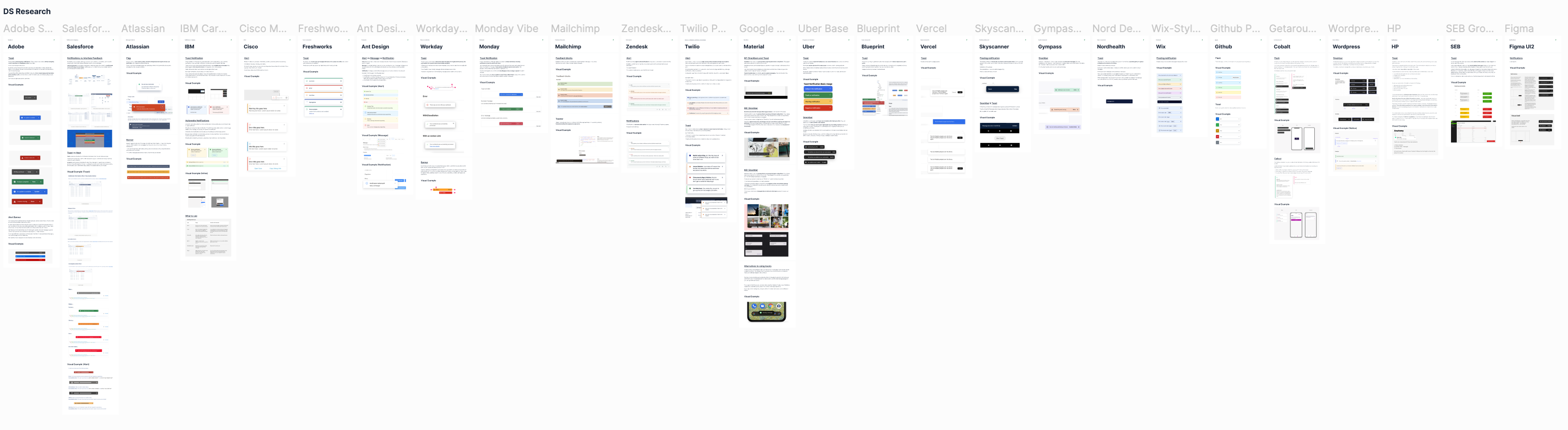
External Research: For the external research I gathered information about notification and user feedback patterns from various design systems, and also looked at the design and guidelines of toast/snackbar components.
Ideation
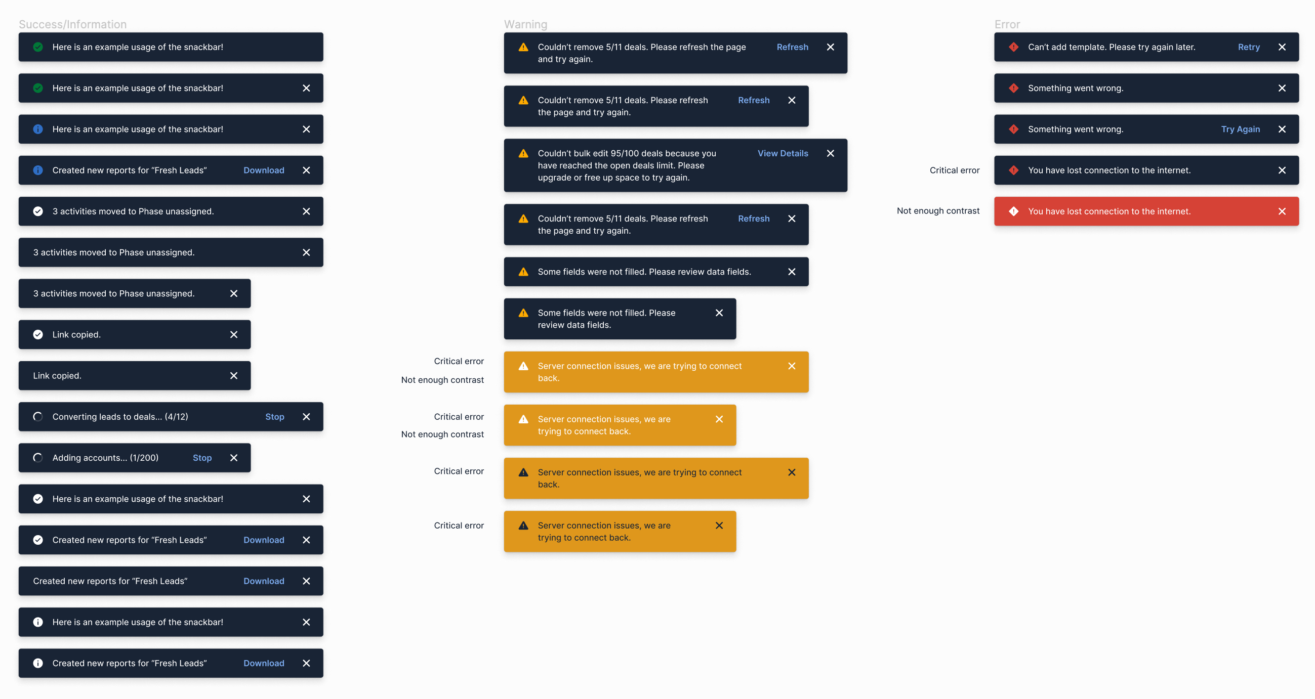
The ideation process included working on different solutions while following the guidelines of the system. Critical error messages were also considered but left out later in the process because they require more attention from the user than we would like to provide by using this component. Some accessibility topics to discuss (like contrast issues) also came up during this process.
Reviews and Discussions
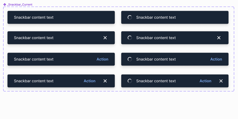
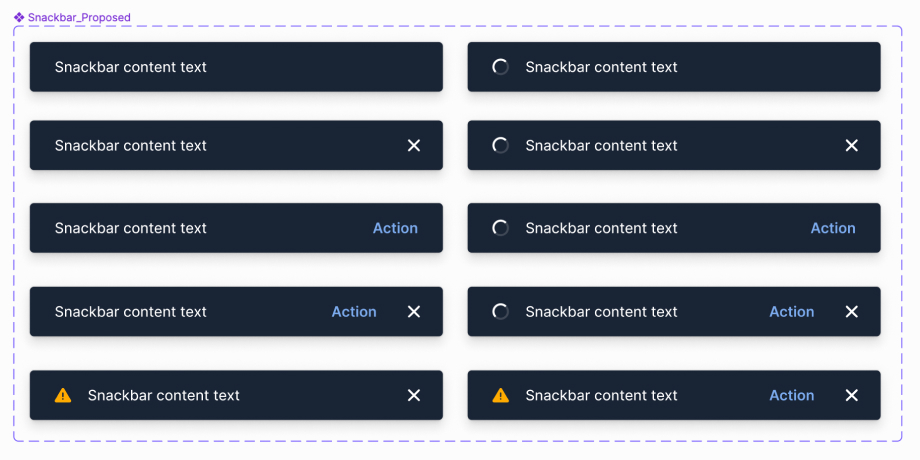
Our team had a couple of reviews and discussions on the design and the suggested guideline updates. In the end, we decided to keep the same style and add only two variants to the existing component and keep the development efforts to a minimum.
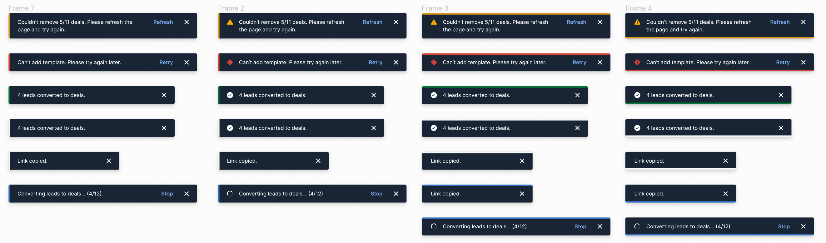
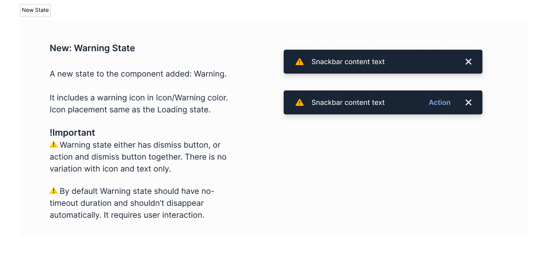
Colorful design ideas were left behind because of getting a lot of attention which was not our intention with this design element. We decided to keep the distraction level low and just have a small differentiator for 3 states (default/success, loading, error), the icon on the left side of the message. No icon for default/success, loading icon for ongoing processes, and error icon for partially or fully failed status messages.
One of the main discussion points was the importance of establishing patterns for notifications and error handling in the design system.
Developer Handoff & Documentation
I finalized the component design, prepared the developer handoff, and updated the guidelines. Updating the guidelines took some time as they are made for an international team (that is spread around the world) and are the main communication channel while using the component. I tried to be as clear as possible, and also asked for and received feedback on the documentation separately.
Developer handoff examples
Outcomes
- Two new variants to update the snackbar component.
- Revised and new guidelines.
- Decision on having "Notification and Error Handling Patterns" in the product roadmap as a bigger project.
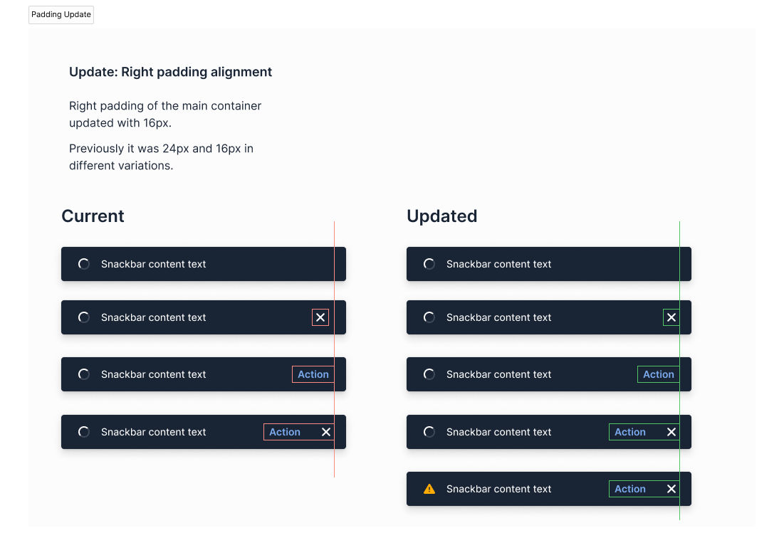
Before
After

New state in use (example)